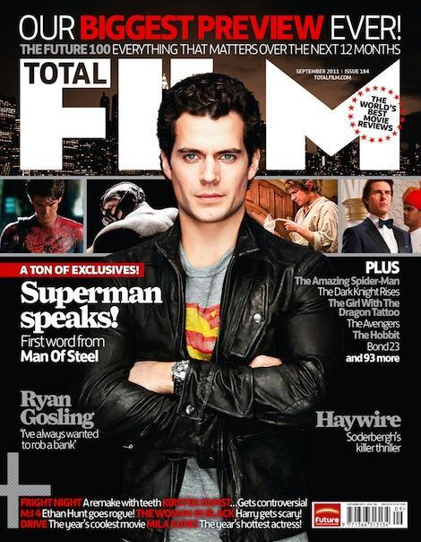
I have chose this magazine as inspiration for creating my film magazine as I like the simple layout of the magazine. I also like how the headline is in a different font to the other fonts on the magazine which makes it stand out. I also like where the headline is positioned, I think that this makes the picture and the headline stand out. It also separates it from the coverless which makes the cover lines stand out. I also like the banner on the top of the magazine explaining what the magazine is about. I also like the bold font on the title that has been kerned so that the individual letters stand out. I will use the bold headline idea from this magazine front cover on my magazine front cover.
I have chose this magazine as inspiration for my film magazine front cover. I like how the cover is simple and has a few coverlines which are in large, bold text rather than a lot of coverless which can make the cover look crowded, cluttered and messy. I also like the way the actors face covers the masthead as this shows the magazine cover is well known and does not need to show the full name of the magazine for the audience to know what the magazine is. I also like the small banners on the magazine cover to highlight important bits of information. I also like how the film title is in a bolder, larger font than the rest of the fonts so that it stands out and its obvious why the actor on the magazine front cover is featured. i will use the bold font used on the title of the film on my magazine front cover to promote my film 'Bottled Up' and make it stand out.
I have chose this students film magazine as inspiration for my film magazine because I like the masthead on the cover. I like how the word 'film' looks as if it is cut out of the word 'Reel'. I also like the simple layout of the coverlines and the banner at the bottom of the magazine cover. I also think that the pug at the top right hand corner of the magazine cover makes the magazine cover look more interesting. I also think that adding the magazines website to the cover is a good touch. I will use the masthead style on my magazine front cover as i like the cutout effect on the two words. I will also use a similar style of pug on my front cover.
I have chose this magazine cover as inspiration for my magazine front cover as I like how behind the main image on the cover is a row of images that look are made to look like a film reel which matches well with the magazine as it is a film magazine. I also like how the masthead is not directly at the top of the page and is slightly lower down. I also like the banner and pug featured on the cover. I will use the film reel style photos on my magazine front cover behind my main image.


No comments:
Post a Comment